Native PonG Widgets
There is a bunch of widgets defined within PonG that are available to any PonG file and all support the native PonG interface. Here is a listing:
- Pong:Check:Group
A group of several checkbuttons. Their label and values are given by the widget options, so you need to set up some for this widget to be useful.
Supports a list of bools directly, however it is most useful when used with a specifier. For any given specifier it will give true or false depending ont he state of the checkbutton that has the same value as the specifier. Another way to use the check group is to select things in an unordered set of items, this is if you use it with list of ints, list of floats or list of strings. The value of the GConf key will be all the values whose checkboxes are on, and it will not contain the values whose checkboxes are off.
Table 1. Pong:Check:Group arguments
Name Type Description horizontal bool Put checkboxes in horizontal, rather then vertical layout - Pong:Color:Picker
Mostly the same as Gnome:Color:Picker, but including some arguments.
Supports the string and int types directly. List of ints and list of floats can also be used in which case these are RGB or RGBA values (for ints these are 8bit values). Floats and ints can also be used with a specifier. The specifier can be "red", "green", "blue" or "alpha". If you use any of these specifiers that specific value will be set or returned.
Table 2. Pong:Color:Picker arguments
Name Type Description title string Picker dialog title use_alpha bool Use the alpha channel dither bool Use dithering in the button - Pong:List:Entry
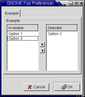
A widget from selecting an unordered set of items from a given set. Available unset items are on the left, selected items are on the right.
This supports lists of strings, ints and floats.
Table 3. Pong:List:Entry arguments
Name Type Description available_label string Label of the column of available items selected_label string Label of the column of selected items - Pong:Option:Menu
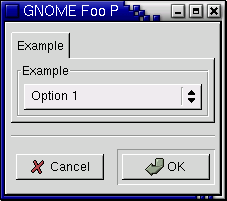
An option menu for selecting an option from a list. The list of items to select from is given by the options.
This supports string, int, float or bool types.
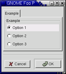
- Pong:Radio:Group
A group of several radio buttons. Their label and values are given by the widget options, so you need to set up some for this widget to be useful.
Supports string, int, float and bool types, which is the value of the currently selected radiobutton. You can also query for true/false of a specific value by using a specifier and a bool type.
Table 4. Pong:Radio:Group arguments
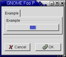
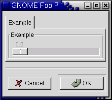
Name Type Description horizontal bool Put radioboxes in horizontal, rather then vertical layout - Pong:Slider
A horizontal slider, derived from GtkHScale. Note that also all standard GTK+ arguments are supported, see the GTK+ manual for details.
Supports strings, ints and floats. Strings are just converted to numbers
Table 5. Pong:Slider arguments
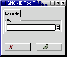
Name Type Description lower double Lower bound upper double Upper bound step_increment double Step increment page_increment double Page increment - Pong:Spin:Button
A spin button, derived from GtkSpinButton. Note that also all standard GTK+ arguments are supported, see the GTK+ manual for details.
Supports strings, ints and floats. Strings are just converted to numbers.
Table 6. Pong:Spin:Button arguments
Name Type Description lower double Lower bound upper double Upper bound step_increment double Step increment page_increment double Page increment